Vegan sustainable brand, 150 videos and 500 pictures
Purezza, plant-based Italian and the UK's first vegan pizzeria. Camden, Brighton and Manchester. A monthly retainer across three restaurants.
The brief
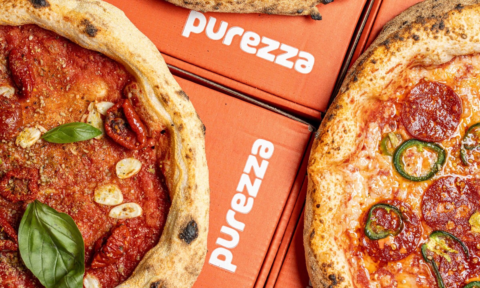
Purezza built a business on sustainable vegan pizza, and they are famous for flavour combinations rather than for imitating anything. That is a harder thing to photograph than it sounds.Plant-based food carries a doubt with it. People assume it will not stretch, will not brown, will not behave. So the pictures have to do a job that pictures of dairy never have to do: they have to remove the doubt before the reader has finished scrolling past.On top of that, they needed a consistent look across three sites, running every month, for an audience that is largely Gen Z, largely women, and genuinely serious about sustainability. That audience notices when a brand tries too hard.
The work

My take
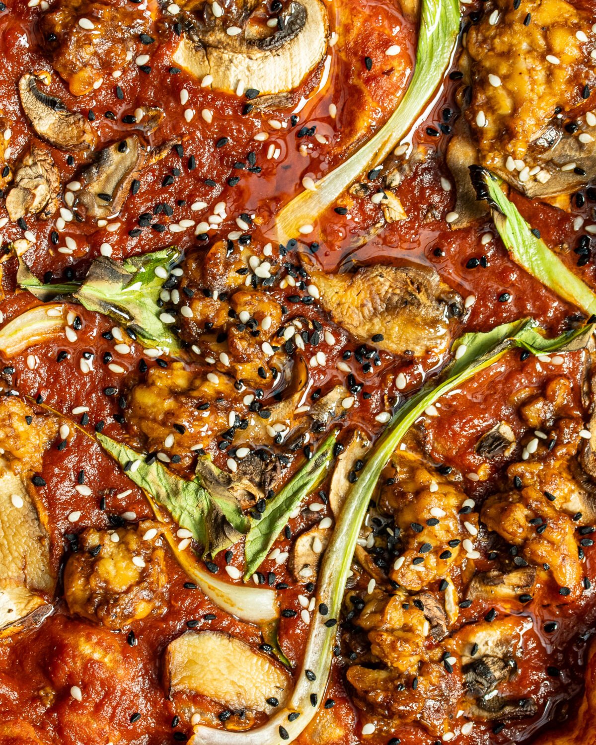
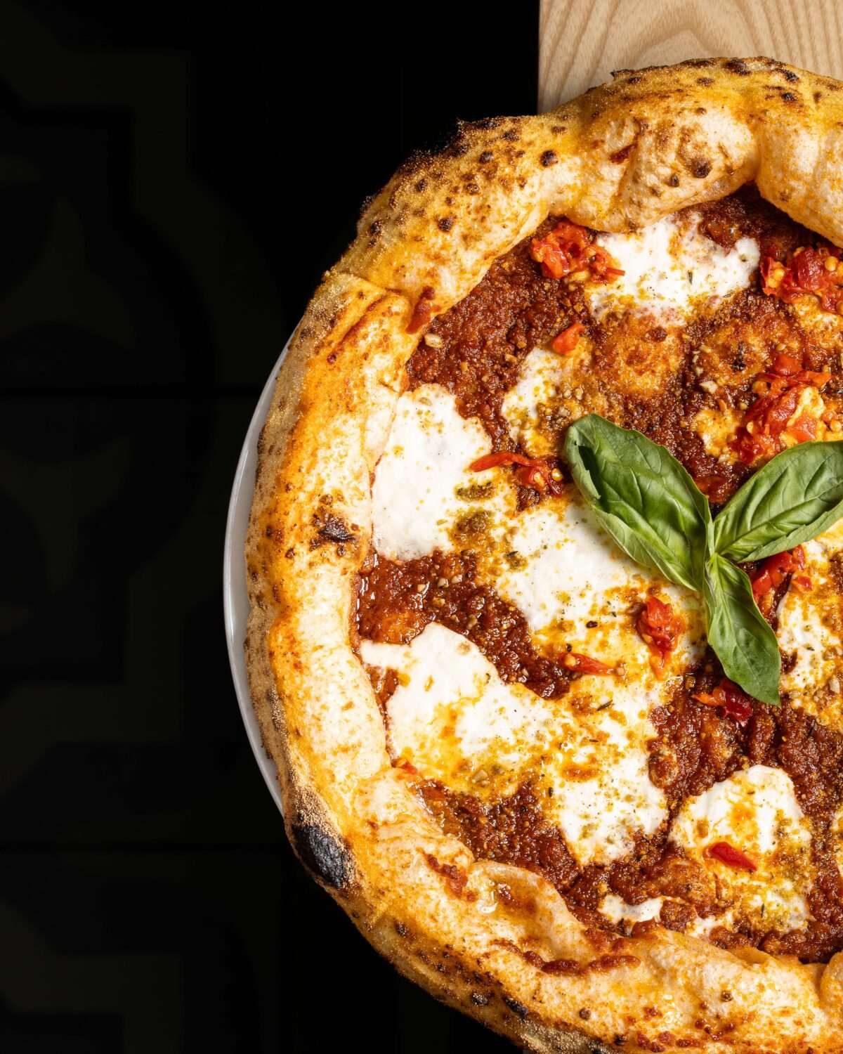
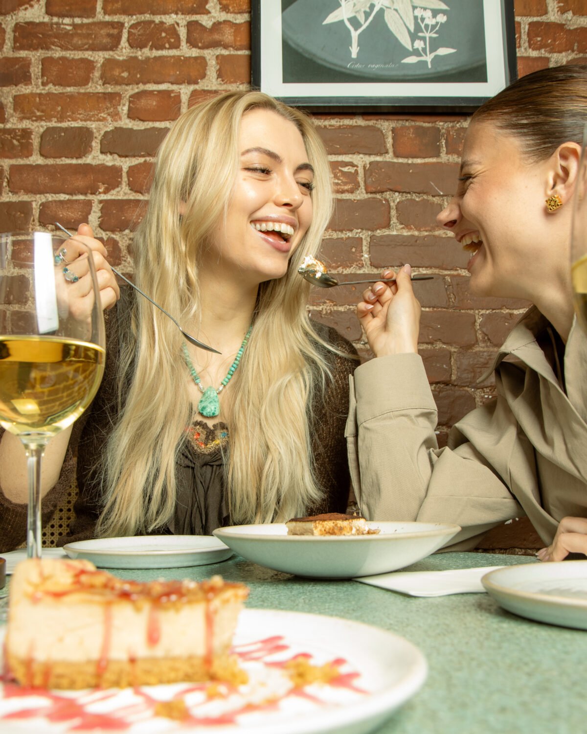
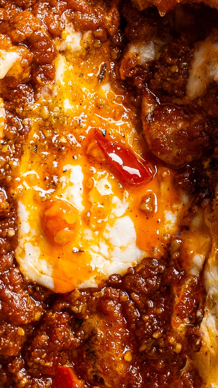
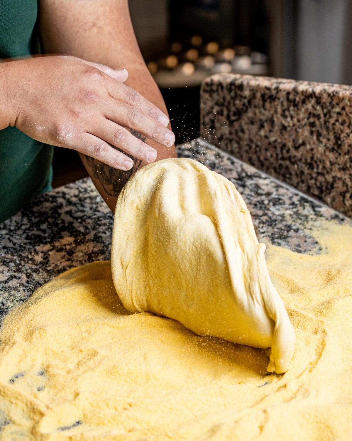
Vegan mozzarella is a different material. It melts at a different rate, it sets faster, and the window where it looks alive is short. Miss it and you get a photograph of something plastic, which is exactly the impression the brand spends its life fighting.Knowing where that window is, and building the shot so the food arrives inside it, is the whole job. That is kitchen knowledge, not camera knowledge.We shot in Camden, and in the Cheese Cellar underneath it, where their specialist vegan cheese is made. Being able to shoot the cheese where it is made, then the pizza it goes on upstairs, is the kind of access that only happens when the client stops treating you as a supplier.The other constraint was unusual and it shaped everything. Purezza has no face. No founder fronting it, no personality, and they wanted to keep it that way. So all the warmth in the brand has to come out of the food and the room, with no person to carry it. That is much harder than it sounds, and it is why the macro work matters so much here: texture becomes the personality.
Approach
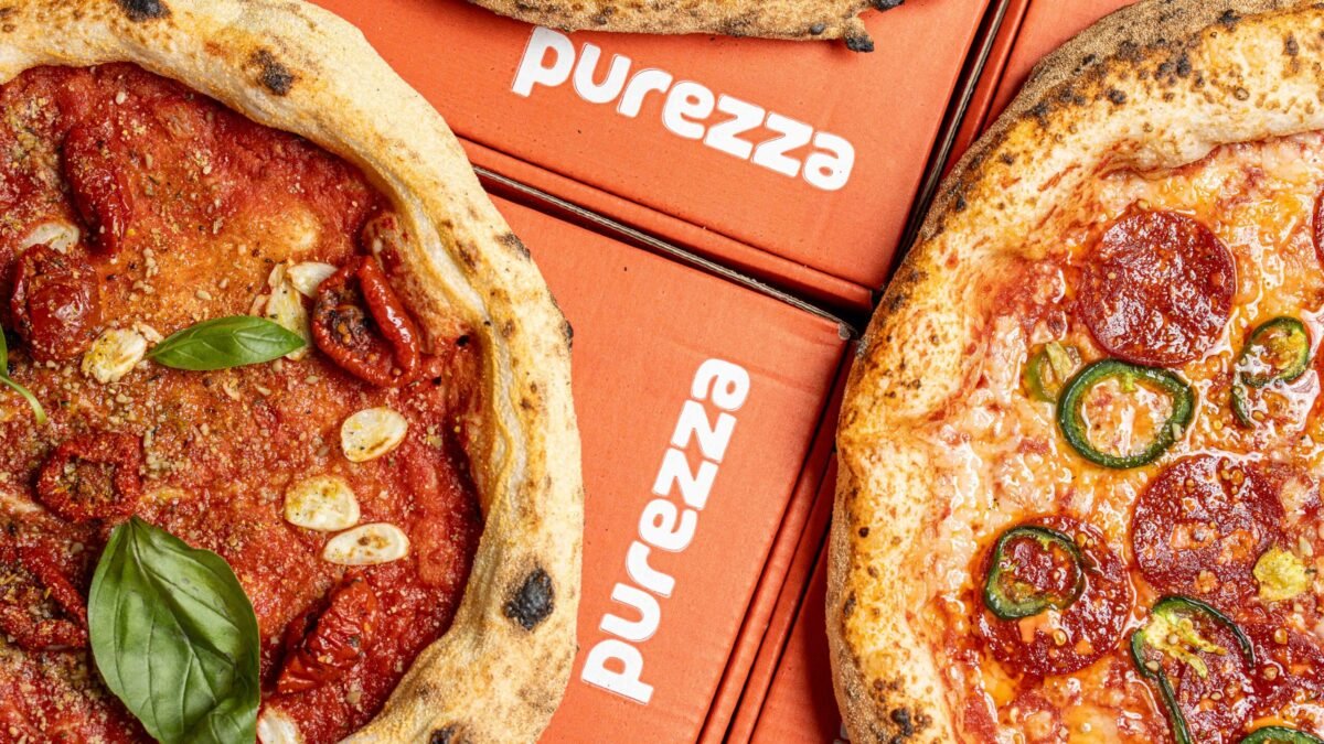
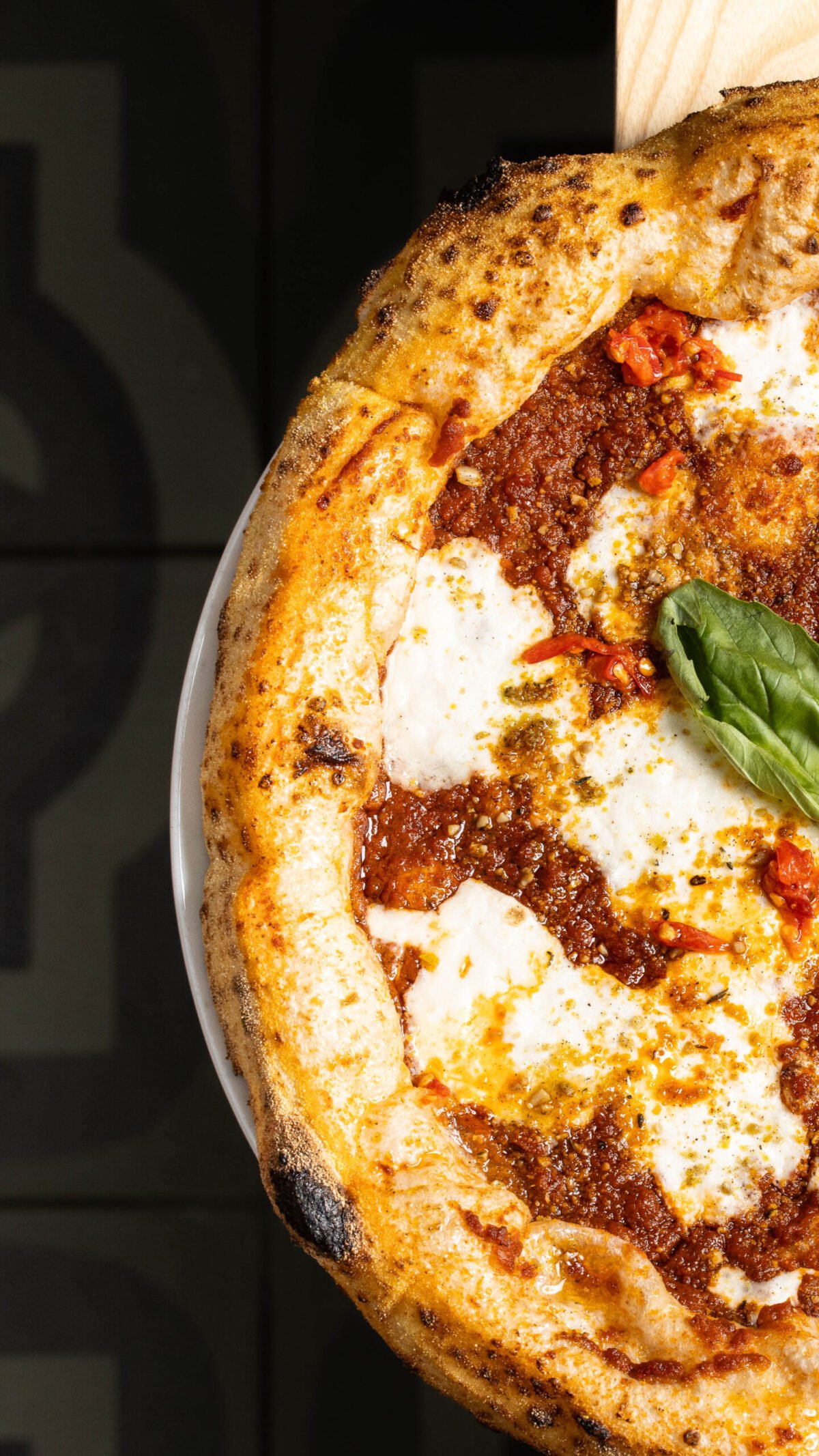
I also built them a way of looking at a pizza. A signature angle and treatment that we came back to on every launch, so a Purezza pizza is recognisable as a Purezza pizza before you read the name. Once that exists, the brand stops starting from scratch every month.The retainer finished in November 2025. The creative bank did not. They are still running the assets, because that is what a bank is for. A shoot gets used once. A bank gets used for years, and it means the brand can keep a consistent look long after the person who built it has moved on. I would rather leave a client with that than with a folder.Purezza is a brand with no face, so everything the customer feels about it has to come out of the food. Fifteen months of that teaches you something no single shoot ever does: consistency is the product. Anyone can make one pizza look incredible. Making the same brand look like itself every month, across three restaurants, for an audience that can smell a try-hard from across the room, is the actual job.
Deliverables
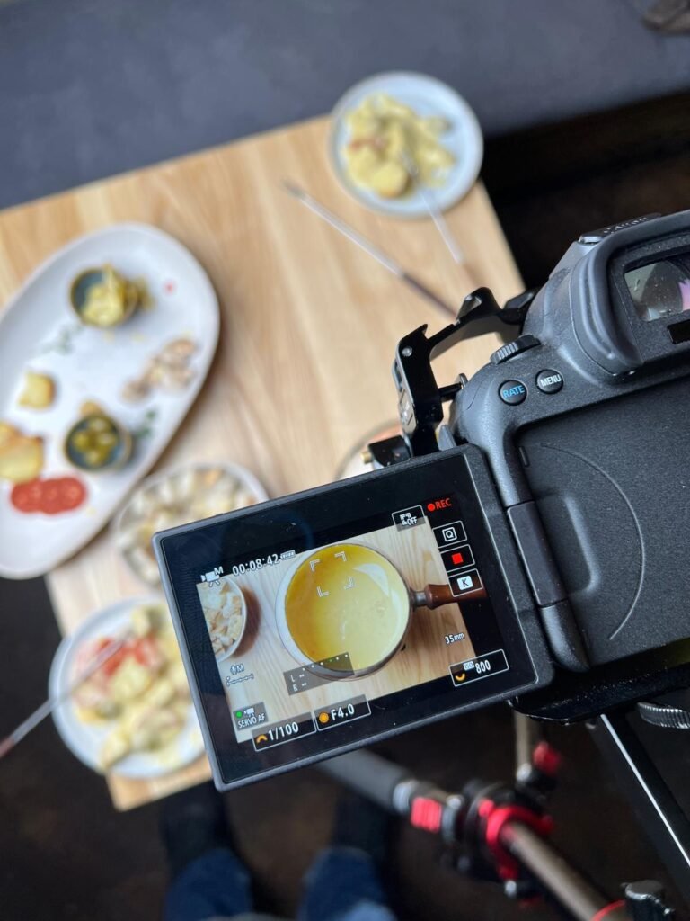
Weekly and monthly social content, food-led and flavour-led, shot around what the pizzaiolos actually doMenu and launch campaigns, five or six of them across the engagementDelivery-platform sets kept consistent across all three restaurantsVideo assets, including the chef movement and the meltsA creative bank: their whole menu, shot from multiple angles, so they hold years of usable variations rather than a single setSeasonal work, including the festive campaigns
Planning a similar project?
Get in touch to discuss your brief.
Talk about the project